
Ollo, it is Hannah. Jumping headlong to the meat of the matter. I was pondering aloud what I could post about today, and my sister Emily, overhearing, suggested I do a tutorial on the covers I make for my books (usually as a form of procrastination - artistic procrastination). Sounded good enough an idea, so as an example, I present my cover for my as-yet-untitled NaNoWriMo novel.

Maybe a bit odd-looking to some, and may not survive the first draft, but it's an example.
I shall now wax eloquent and speak lengthily, so if you are not at all interested in covers, you may skip this entire post, because that's what's for lunch.
To begin with, I went to Pinterest (surprise, surprise... it's a writer's best friend and worst enemy) and found these images. None of them belong to me, they are just for experimentation and all of the credit for the images goes to the original owners. I don't know who they are, sorry. If you do know, speak up or forever hold your piece. Peace. Whatever. (I'm a writer, I swear!)


There were a few other pictures I'd picked out, but these four are the ones that made it into the final cover image. They have things to do with the story, but I'm not giving away spoilers right now.
Next, I opened them up in Photoshop. I have Adobe Photoshop Element 7.0 (I know, super old compared to these 12.0s coming out, but I like it, it's easy to use).

I opened up all the images on one file (on different layers, mind) and I arranged them in the general places they would be in on the cover.

Blending them together was super easy, way easier than I thought it would be. I took an eraser and put it on a fuzzy-edge setting (that probably has some sort of special name, but I call it fuzzy-edge - sue me) and put it on 87% opacity. For those of you without the knowledge of Photoshop lingo, that means the eraser is making the picture transparent, but you can still see the erased part of the picture faintly. I've found that makes the transition smoother. To any of the people who have used Paint on the computer, it's like that, but fancier.


Look at all the fluffy looking pictures! All smooth and pretty. But I'm still not done, because I'm a perfectionist. The background was looking a bit too dull for my taste.
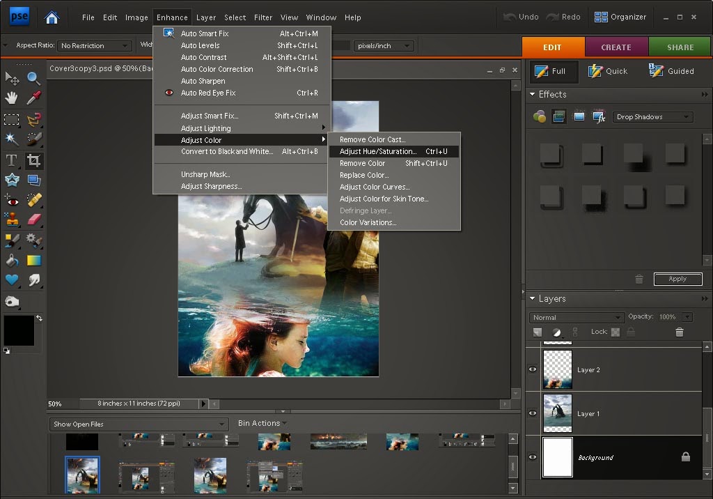
I clicked Enhance, went to Adjust Color and Adjust Hue/Saturation, and fiddled with the saturation levels until I was satisfied (not the hue ones, though, because I liked the color).


You may be able to tell the slight differences between the before and after pictures in the background. The hill is a bit greener and the clouds are a bit bluer. Not overly obvious, but still.
And this is the finished product. Several months after making the first copy, I went back and decided to fade the backgrounds on the upper left corner and the center right side a bit more (with the handy-dandy eraser). I haven't made a title for it yet, so if something seems to be missing, that's it.
I specifically picked the colors for this one to be brighter and more light-hearted. This is a prequel to my other series (which, no, I haven't written yet), and quite a bit less dark, especially cover-wise.


(These are three of my other books... As you can see, none of them have titles...)
So there you are, lovely people. I have an urge to say peeps, but I refrain. I hope this was at least a little bit informative, though it may be easier for you to go and use Instagram or whatever. In this family of Photoshop users, I have been trained to be prejudiced against Instagram (it's been said that it's like Paint is to Photoshop, which is to say, neanderthal) but don't take that as me judging whichever person prefers that method. Not outright, that is.
If you do not, in fact, have Photoshop in your possession, that's okay, as long as you have a computer to work on, because I believe you can download the older versions for free somewhere. Keep in mind that the newer the edition is, the better it is, but the harder it will likely be to use, especially if you're used to something simpler.
Now, I have to give the credit to Trinity for the basic idea of how to do these covers. She showed a picture of her Tribes Of The Earth cover in this post and told me how to do it. It is, in her words, "spiffy".
So I think I'm done babbling on. And by the way, the piece/peace thing up there was a joke. Ha ha. No, really, it was...
Oh! I forgot to mention! Our Blogoversary is in two days! We'll do something special (I hope), so mentally mark your calendars.
Sosrin God ignt eht ceallian,
(To God be the Glory)Hannah
Haha. The other day I was also procrastinating outlining by making a cover, but instead of using pictures, I drew the cover on my screen using a drawing tablet and the paint feature of my photo-editor (plus about 10 layers and a gradient feature.) I don't have photoshop, but do use a website called Pixlr which is pretty much a lesser version of the simple photoshop (but I still think I need to look into getting the actual photoshop program.) Your method is really cool, too!
ReplyDeleteI just remembered that we have a drawing tablet too (I think it's called a bamboo tablet or something), I'm just way too lazy to get it out and plug it in. Drawing your own covers is probably a better idea, considering copyrights and stuff. I've thought about it but I'm not sure if my artist skills are advanced enough for that. And by the way, thank you so much for commenting! It's always exciting to find out that someone is really reading this.
Delete